
I am an unashamed geek at heart. I’ll drop whatever I am doing to look at gear and tools at any time. An article titled “2 Performance-Enhancing Digital Tools for Cyclists” on Active.com caught my eye last week.
Of the two cycling apps discussed in the article, VeloViewer immediately appealed to me. I clicked on the in-article link without reading much about the second app, Golden Cheetah.
VeloViewer links to your Strava account. The initial setup will take some time if you have a lot of rides saved. Once all your data is imported into VeloViewer, there are multiple ways to visualize your rides.
The opening screen has eight tabs. Click the Summary tab and the app lists your activity statistics at the top of the screen. I haven’t included that part of the screen in the shot below. The statistics include: Activity count, Total distance, Total elevation, Total time, your top five rides by Maximum distance, your top five rides by Maximum elevation, and your top five rides by Maximum time.
These statistics can be filtered by year, by activity type, and gear type.
The main part of the screen is in the screen shot below. It shows all your rides in a variety of ways. Rides are sorted by distance, elevation, and time. Hover over one of the boxes, and details of the rides in that category are displayed.
In this case the screen shows all years, and a combination of all gear types. In my case gear types are the three bikes I own.
The line chart on the left lists my rides by year. My Strava account has rides starting in 2010. So there are five lines for each year from 2010. You can select what the lines show: total distance, total elevation, total time or number of rides.
The graph paper table on the right lists all my rides, again by year. I chose the day view, but you can choose to show rides by week or month. Most impressive is that each of my rides are color-coded from light yellow for lowest value, to deep red for highest value. The values themselves are user-selectable from nine categories, including average heart rate and average power.
On the lower left are summary statistics off all the segments I have ridden, and on the lower right are climbing statistics listed by category of climb.
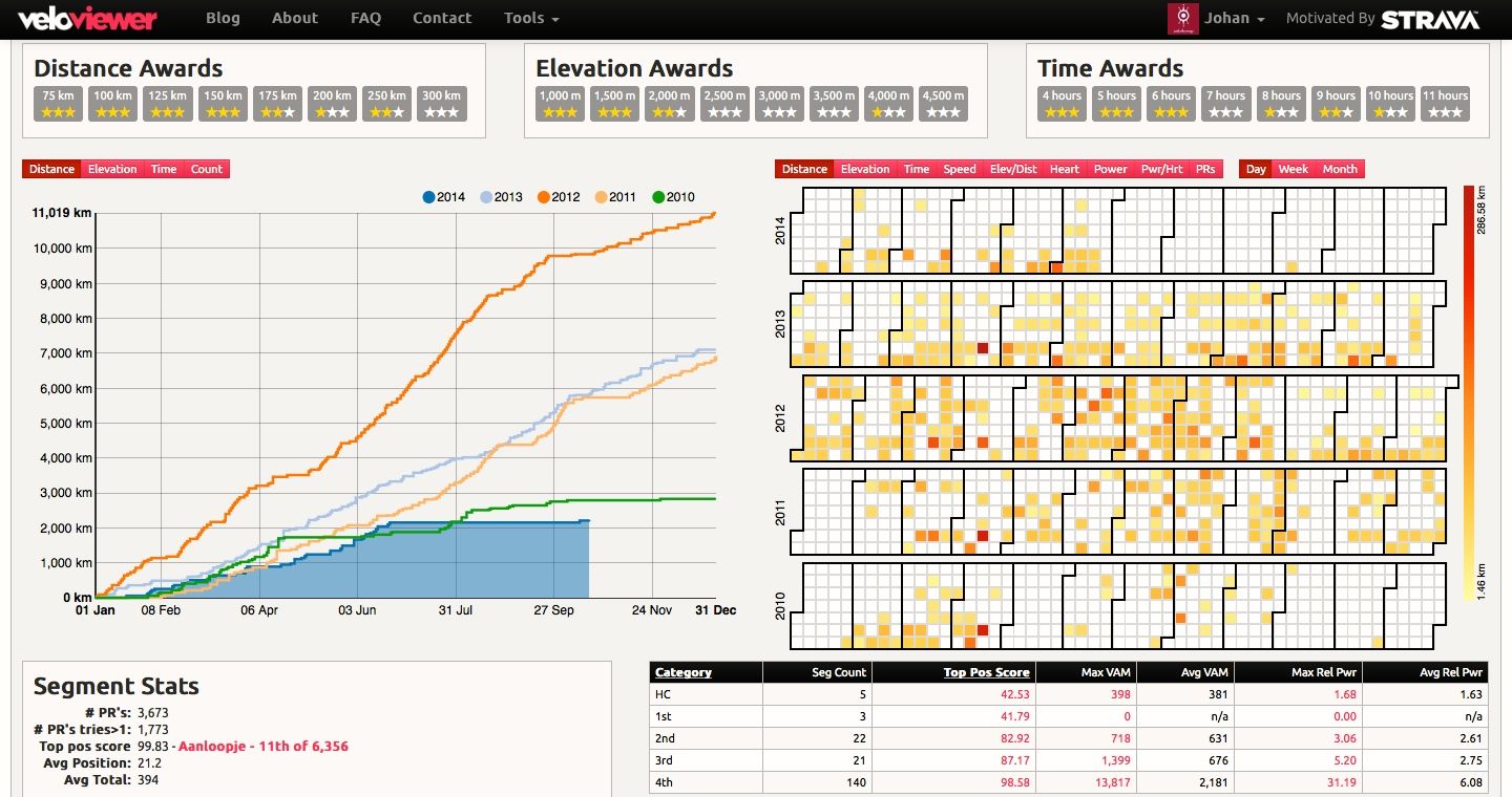
Screen courtesy of veloviewer.com
There is more to the summary screen, which is not shown in the screen shot above. Scroll to the bottom of the summary screen and you will see your ten most recent activities, and a summary of activities by gear. In my case summary details of all the rides I have done on each of my three bikes.
Click on a ride, and you are taken to a map of that ride, like the one below, shown in full-screen view. In the normal map view, the profile of the ride is displayed along the top of the screen. As you move your cursor along the profile, a marker shows the corresponding position on the map.
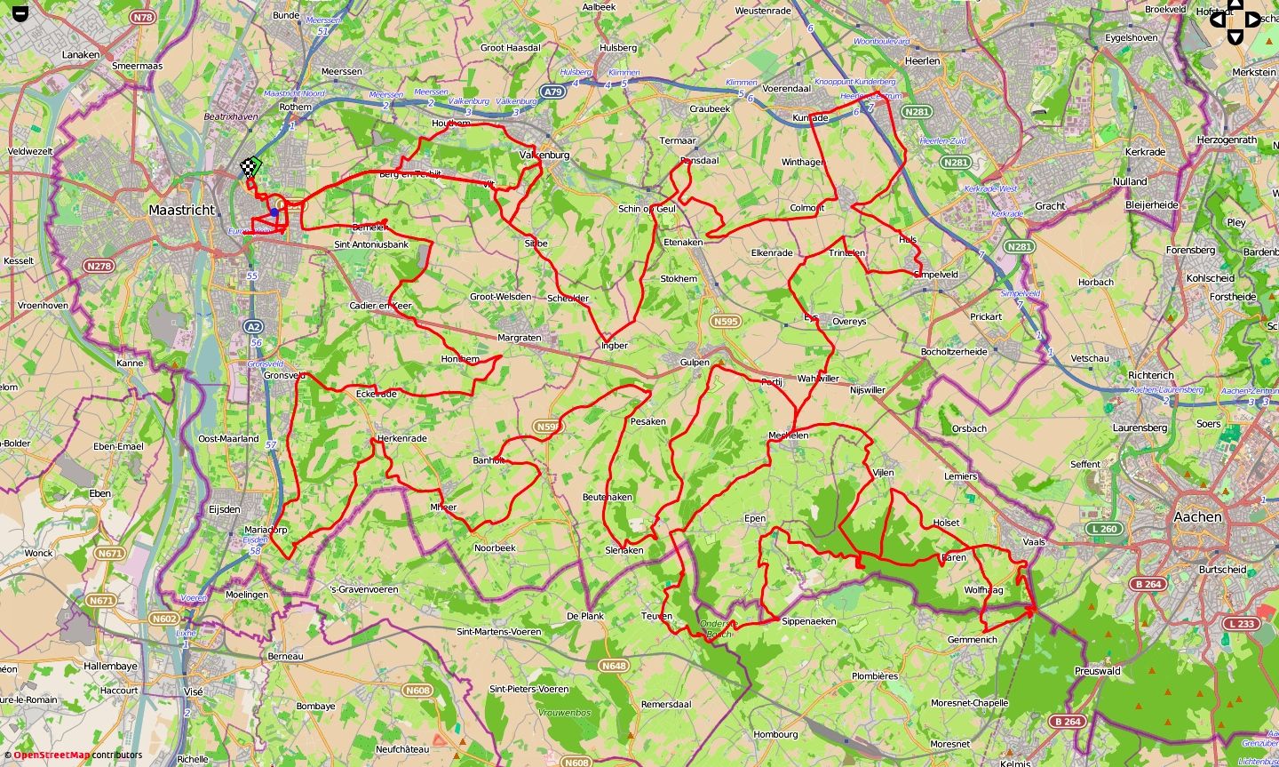
Screen courtesy of VeloViewer
There are a number of other views, including this 3D profile of the route in the map above, color-coded by steepness of each segment.

Screen courtesy of veloviewer.com
There are seven other tabs that display an array of data about the selected ride.
There is more to this app that I have yet to explore. Which makes this a dangerous app for geeks like me. The last thing I need is yet another way to fritter time away.
It is bedtime. Tomorrow’s ride starts at 6.30am. I’ll just take a few more minutes to explore the Wheel tab.

Screen courtesy of veloviewer.com
All your rides for the current month or a user-selected time period appear on the outer ring of the wheel. The elevation profile is also displayed, along with the length of each ride. Click on a ride, and its segment rotates to the top of the wheel. The map of that route occupies the center of the wheel.
If you download VeloViewer – happy frittering!
