Infographics make complex information eye catching, shareable and easily digestible. The best ones combine eye-catching graphics with interesting facts.
For example, A World of Languages. Did you know that 146 living languages are used as a first language in Malaysia?

Graphic courtesy of Alberto Lucas López
Unsurprisingly, there are lots of infographics to do with cycling. This one plots the increase in the number of riders who completed the Rapha Festive 500 between 2011 and 2014.

Graphic courtesy of Rapha
For 2017, the number of roundel winners is above 19,000.
More details about the 2012 and 2013 Festive 500s are presented in these infographics.
Some activity-tracking sites produce individualised infographics. Strava is perhaps the most popular online cyclists’ community, with 203 million rides logged in 2017.
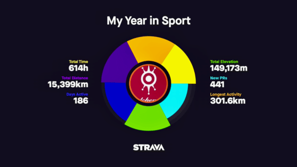
Each cyclist using Strava can generate a movie summarising their own achievements in 2017. The closing graphic looks like this.

Graphic courtesy of Strava
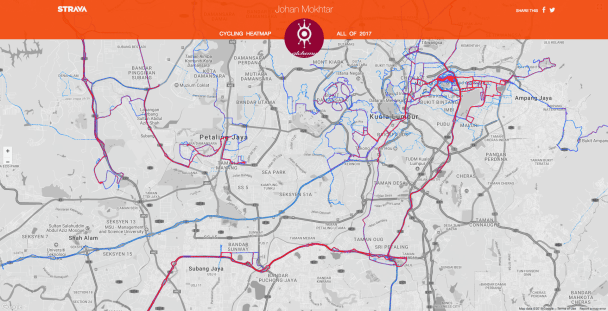
Strava also lets members generate heatmaps showing where they have ridden during a user-selected time period. The color used highlight the routes changes from blue through purple to red, depending on how often that particular route has been ridden.

Map courtesy of Strava
Third parties can access Strava’s data to produce their own infographics. This is the heatmap produced by Jonathan O”Keeffe’s Strava Multiple Ride Mapper application. It improves on the native Strava heatmap by using a wider range of colors to indicate ride frequency.

Map courtesy of http://www.jonathanokeeffe.com
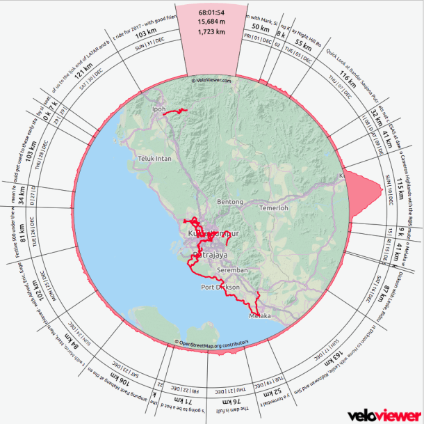
Veloviewer.com is another third-party application that pulls data from Strava to create individualized infographics.
One is a variation on the heatmap, supplemented with the date, distance, and elevation of each of the rides within the user-selected date range.

Graphic courtesy of Veloviewer
The more popular Veloviewer infographic, especially at year-end, is the one which tracks a variety of measures through the year.

Graphic courtesy of Veloviewer
Madewithsisu.com uses your Strava data to produce art, rather than infographics in the strict sense of the word.
Like Veloviewer, the user selects the time period from which data is to be used. Clocked represents each of your activities as a ring. They start when you started and finish when you finished.
The Multi-Route plots the route of all your rides for the chosen time period.
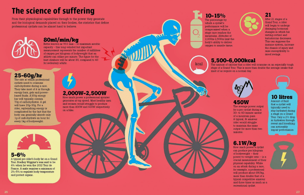
If you are interested in more infographics about cycling, like this one . . .

Graphic courtesy of Velopedia: The Infographic Book of Cycling
or this one . . .

Graphic courtesy of Velopedia: The Infographic Book of Cycling
then Velopedia: The Infographic Book of Cycling is the book for you.


