I was chatting recently with a friend about bell curves. We were discussing employee performance evaluations. Whether or not to force-fit performance evaluations to a bell curve is a debate that often comes up.
A bell curve is a graphical depiction of a normal distribution. The theory is that the majority of employees should fall into the “Average Performers” category, and 15% to 20% of employees should fall into either the “Low Performers” category or the “High Performers” category.
This morning, I clicked on a link for a post titled Strava Year In Sport Trend Report: Insights on the World of Exercise. The post summarised average speed and distance data for cycling activities uploaded to Strava between October 1, 2022 and September 30, 2023. I wondered where I fell on the bell curve of cycling performance as tracked by Strava.
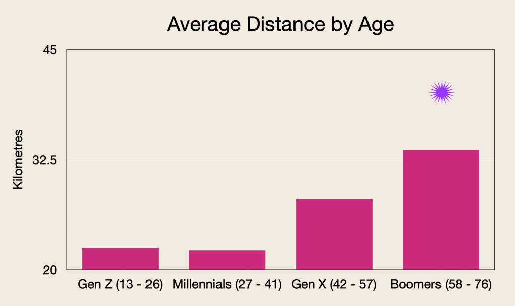
The post lists average cycling speed and distance by age.
There is very little difference in average speed across the four age categories. Just half a kilometre per hour separates Gen Z at 20.8 kph and Millennials and Boomers at 20.3 kph. Gen X averaged 20.6 kph.
My average speed in 2023 was 20.8 kph (indicated by the *). Above average as a Boomer.

Interestingly, Boomers had the longest rides, averaging 33.6 km per ride. Millennials had the shortest, at 22.2 km per ride. Perhaps we retired Boomers have more time to devote to cycling.
I am happy that my average distance of 40.2 km (indicated by the *) is above average for not just my Boomers category but for all age categories.

I am on the right-hand side of the bell curve for both average cycling speed and average distance per ride. For the population of cyclists posting on Strava, anyway. As a Boomer, that is a blessing.
* μ (mu) represents the average or mean of a particular sample.


Pingback: Happy to be Average-ish | Old Roots, New Routes